Perspectives magazine
A print magazine to raise awareness about accessibility and inclusive design
My role: editor
Read the magazine (pdf)
_______________________________________________________________________________________
In 2018, Sightsavers' web, design and branding team was looking for ways to raise awareness about accessibility among creative professionals. We hosted a stand at the 2018 D&AD Design Festival, showcasing interactive exhibits to encourage people to think about the world from the viewpoint of people with disabilities.
To prompt further discussion, we created an editorial-style magazine containing features on accessibility topics. As editor, I planned, wrote and commissioned the content, and worked closely with the graphic design team on the creative concept. The magazine was distributed at the D&AD Festival and a CharityComms seminar, resulting in 50 creatives taking part in ideas hacks for Sightsavers. This led to significant industry interest in our work, and offers of pro-bono support.
Perspectives was shortlisted for a Design Week Award in 2019. A feature from the magazine was published in Creative Review, and Sightsavers was profiled in French design magazine Étapes. The publication also featured at the Global Disability Summit in London, in July 2018.

About the magazine: accessibility features
Many agencies pay lip service to accessibility and inclusive design. But in reality, accessibility is often an afterthought, and may be overlooked completely. Most creative professionals do not actively avoid addressing accessibility: instead, many are simply unaware of it.
Our aim was to highlight the importance of accessibility in a high-impact, cost-effective way. Our priority was to follow accessibility best practice, using easy-to-read typefaces, high contrast, clear signposting and accessible language.
Title
‘Perspectives’ reinforces the idea that to be truly inclusive, we must look at things from a different angle and consider other perspectives aside from our own.
Cover
The graphic is based on the ‘dazzle’ camouflage effect used in the military, showing that things are not always what they seem. The gloss spot UV on the clear S of Perspectives suggests a group versus individual viewpoint.
Layout
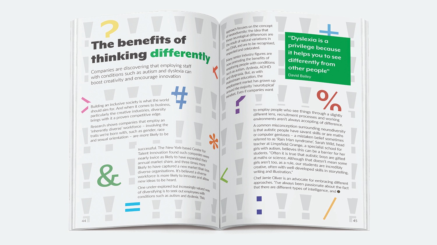
Each feature has its own theme, colour and background. The text is broken up with pull quotes and boxouts to avoid large chunks of copy, which can be daunting for people with dyslexia and other sensory processing conditions.
Typefaces
The headlines use themed typefaces to distinguish each article, but the body font is consistent to avoid confusing readers. All body text is 12pt (the minimum recommended size to ensure legibility) in Lato, Sightsavers’ brand font, chosen for its clear letterforms and distinct characters.
Size
The small-format B5 publication is easy to hold, particularly for people with mobility issues.
Colours and contrast
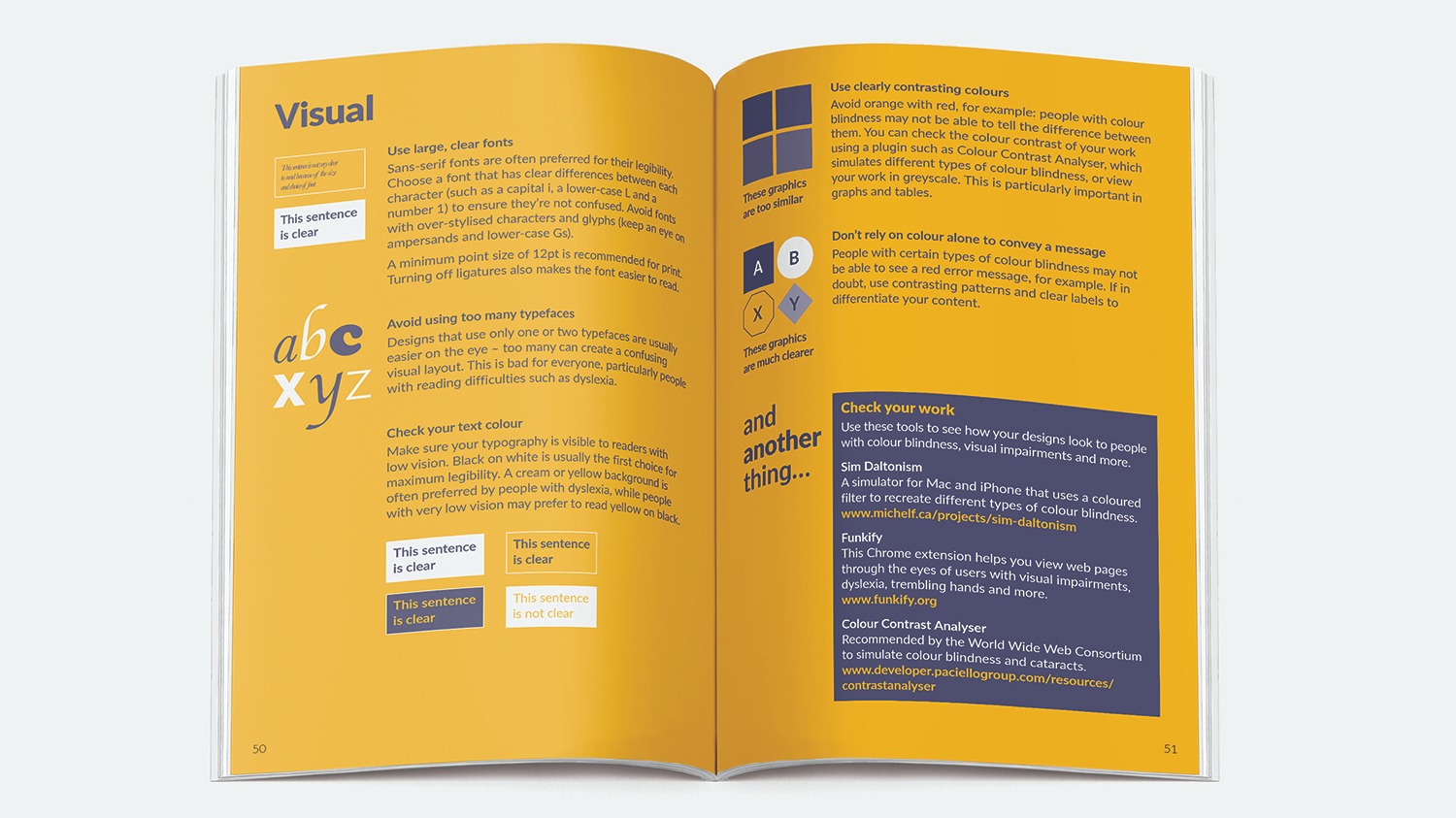
Vivid colours are used to make content as visible as possible, ensuring strong contrast between text and backgrounds, with shades that can be differentiated by people with colour blindness. All text sits on a block of solid colour, ensuring detailed background images can be used without compromising legibility.
Accessibility guide
The final section contains accessibility tips and user personas to help designers consider a diverse audience. It is printed in two spot colours on uncoated stock to differentiate it from the rest of the magazine and encourage its use as a reference tool.

Post a comment